Week 2
Good UX – Calibre eBook Management
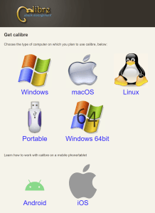
While this site isn’t much to look at, this page is well-designed. It’s clear where to click to download depending on your computer type. Even for someone who isn’t great with computers, it would be obvious what to do next.
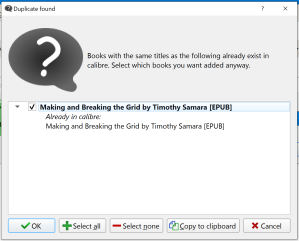
Bad UX – Calibre eBook Management
Even though the download page is well-designed, the program itself could use a little help. I have the PDFs of my books saved in my documents. When I want to open the book, I’d like to be able to click the file and have Calibre open it. Unfortunately, if you try to open the file, you get this notification:
Week 3
Good UX – Disney+
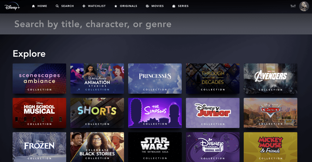
I really love Disney+’s search page. Not only is it clear where to type your search term, they have a variety of sections to “Explore.” A lot of the time I don’t know what I want to watch (I’m usually putting stuff on in the background and not really paying attention) so the explore sections are really helpful. The only way this could be improved is if there was an “Explore” menu option as well.
Bad UX – SnapChat
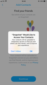
I was viewing a video snap from one of my friends when the pop-up on the screenshot appeared. I hit OK thinking the pop-up would go away and I could keep watching the snap. Of course not. It brought me to my settings. The snap then timed out and I had to message the friend asking her to resend it. It would be ideal if pop-ups only showed up when you are not viewing a snap since they only show for a certain amount of time.
Note: I found the screenshot on Google since this was a fleeting occurrence.
Week 4
Good UX

I get an email like this everyday from USPS. I love that I know what mail is coming in case I’m expecting something and that I can see what packages are coming today or arriving soon (so I know to get my mail as soon as it’s delivered to avoid porch pirates). This email was especially well done because it gives me a link to shop under the JoAnn Fabrics circular I was receiving.
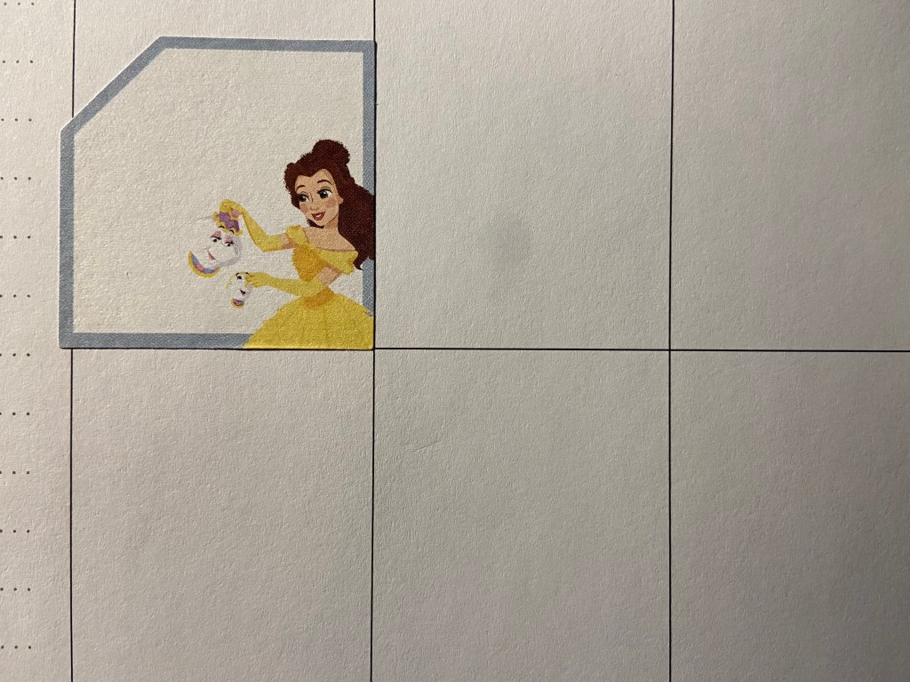
Bad UX – Disney Princess Planner Stickers
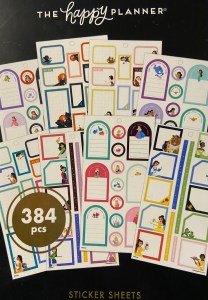
I have a Disney Happy Planner. I ordered some Disney Princess Happy Planner stickers. They’re boxes to add notes. Unfortunately, they’re slightly larger than the space in my planner even though they’re the same brand, same line, and the pictures of the stickers online show they should fit within the box.
Week 5
Good UX – 3D Printed Cribbage Board

My fiancé got me this 3D printed cribbage board recently. It’s very well designed. Normally, the pegs are housed in a compartment under the board and are loose meaning they can easily get lost. On this cribbage board, the pegs aren’t removeable–they’re built into the board so you slide them through the channels instead of placing them in a hole.
The two halves of the board (green and blue) come apart so you can easily play on the go. They also have a space between them that perfectly fits a deck of cards.
Bad UX – Postmates
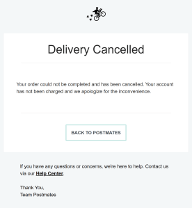
We placed an order on Postmates Friday night. About twenty minutes later, we learned our order was canceled. We didn’t get a reason (complaint #1) and we didn’t get a notification on the app (complaint #2). My theory is that the order was placed close to closing time so the restaurant canceled the order. If this is the case, Postmates shouldn’t have let me place the order or at least warned me that it was close to closing and the restaurant might cancel my order–then we could make a back-up plan.
Week 6
Good UX – Chase
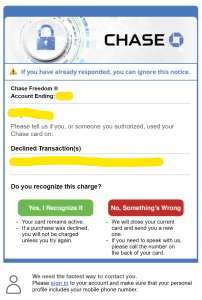
I was placing an order on a website I had never ordered from. Chase declined the purchase then sent me this email. The design is simple, but very well done. It’s clear what they’re alerting me of and the color of “yes” and “no” make it obvious what to click. The email was automatically sent when the card was declined (I got it within minutes of trying to place the order). I also really like that they tell me at the bottom that I need to tell them the best way to contact me. I was initially annoyed that I got an email rather than a text, but now I understand that’s on me, not Chase.
Bad UX – Chick-fil-A App

The Chick-fil-As near me are always crazy busy. Because of this, we order ahead on the app for curbside pickup. I was running an errand in the next town over and was picking it up for dinner. I found the location nearest me quickly & easily (good UX). When I tapped “Start my order,” I got this message:

If I can’t place an order on the app, it shouldn’t give me the “Start my order” option. I’d also really like the option to filter by how I can order.
Week 7
Good UX – brainfuse JobNow
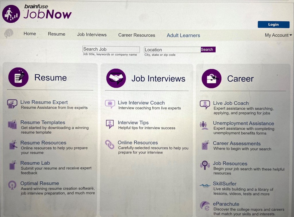
I recently discovered all the online resources my city library has to offer. The resume/interview/career assistance was really interesting to me. While I wasn’t ready to start receiving help when I initially clicked the link, I was impressed at how well designed the landing page is (even if it’s quite simple). It’s really clear to the user what services they offer and the specific services that are available under each category. Even though I’ve never used a site like this, I was able to find what I needed in about 3 seconds (Resume, then “live resume expert”).
Bad UX – Hobby Lobby
While I don’t often go to stores right now, I went to Hobby Lobby recently and saw this sign:

I immediately read it as “let’s good, eat food.” I had to do a double take to re reread it because I was so confused. I’ve shown multiple people this photo and they have all said they read it the same way. What’s even more wild is that they’re two different frames–they’re meant to be hung spaced apart from each other which will make it even harder to understand what it’s supposed to say.
Week 8
Good UX – USPS Schedule Package Pickup
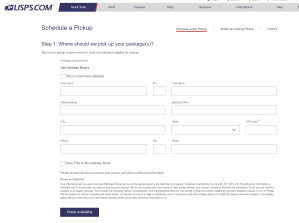
I needed to ship a few packages via USPS recently. I was struggling to find the time to get to the post office during the day. My fiancé had used USPS.com to ship smaller packages so I decided to try it. The form is incredibly easy to follow and you’re done in about 3 minutes.
Bad UX – Spotify
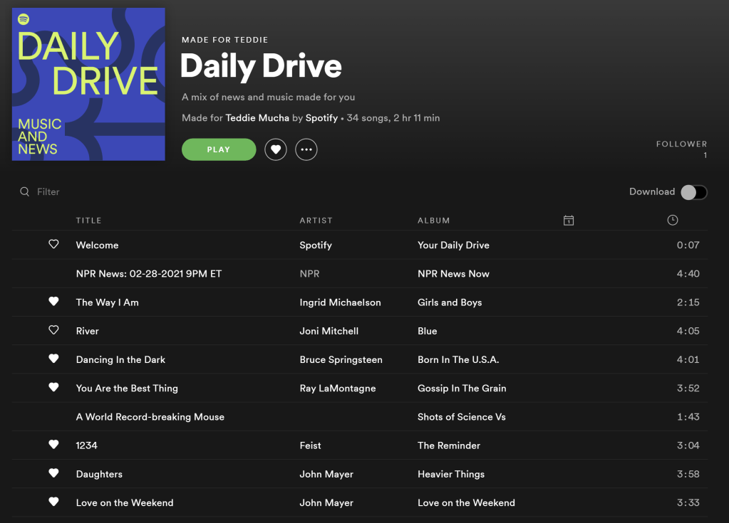
I absolutely love the playlists Spotify curates for me, but I’m frustrated by the fact that this playlist has had the same songs for like two weeks now. I understand the algorithm knows that I’ve listened to these songs quite a few times, but I’m listening to them because Spotify is feeding them to me. It’s a vicious circle. I would love for Spotify to add the capability to take a break from a song or artist for a while (which Pandora has made an option for a long time so it’s possible). I have seen the option at times, but I haven’t been able to pinpoint when it’s possible.
Week 9
Good UX – 1800-Contacts
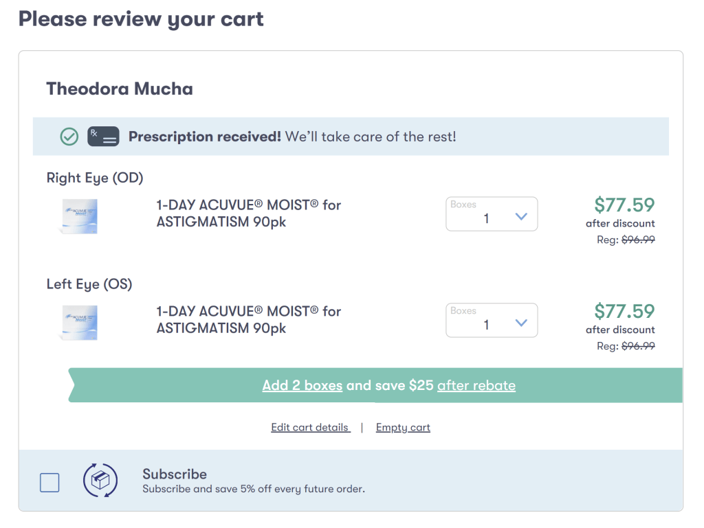
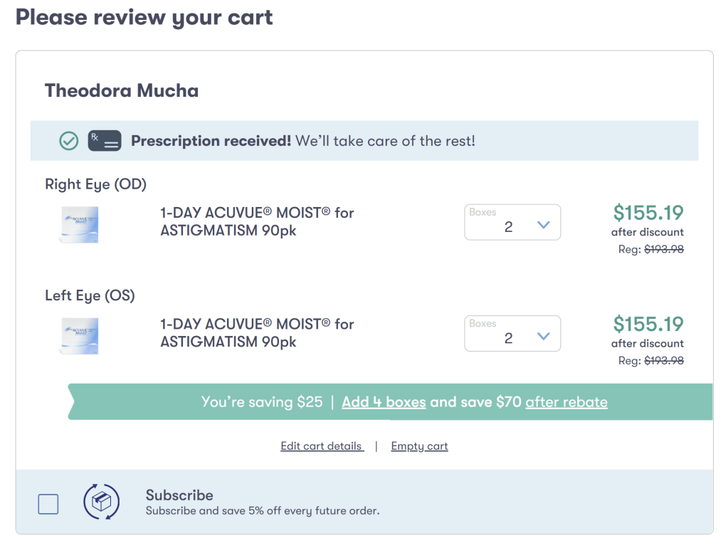
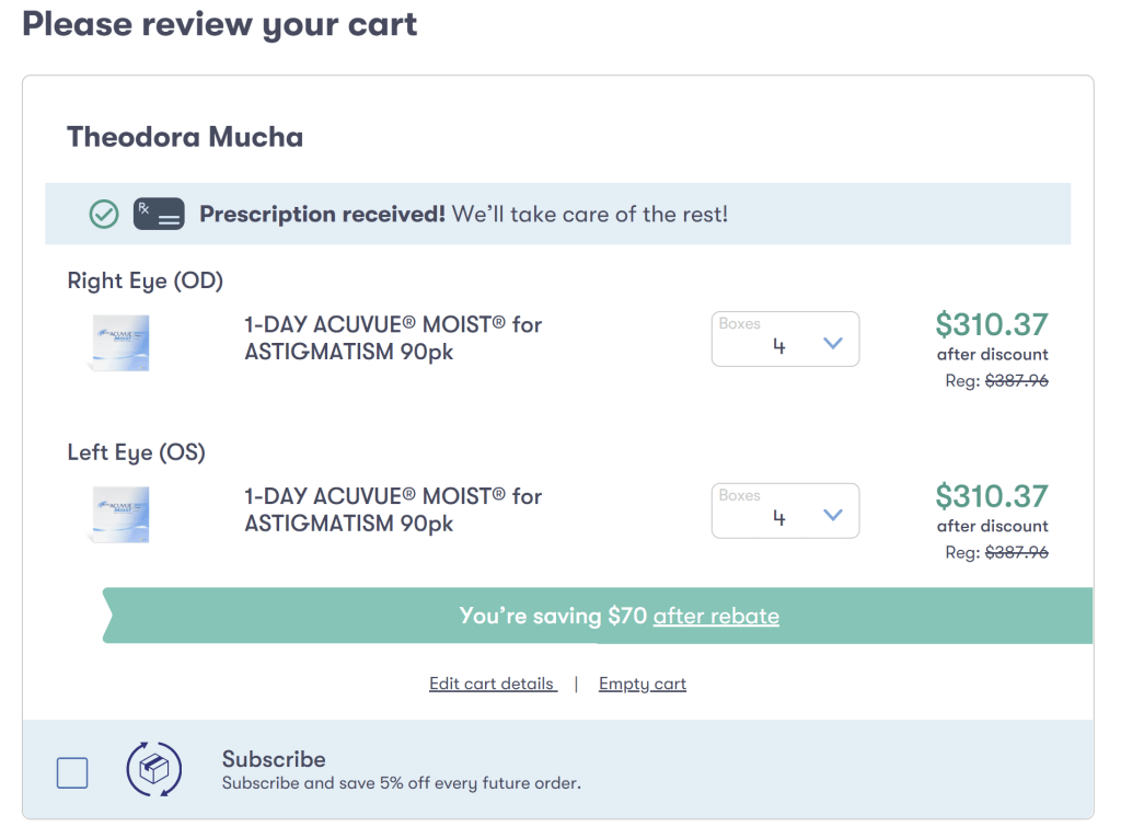
I recently went to the eye doctor and I’m trying out contacts. I was searching for an online option where I could order contacts that would be more affordable than the eye doctor and I found 1800contacts.com (which offers a 10% student discount by the way).
In the screenshots above, you can see the teal banner tells you if you increase the number of boxes you order, you’ll get a higher rebate. If I planned on wearing contacts every day (as I’m using dailies), I would probably take advantage of ordering multiple boxes to get the higher rebate. It’s a great example of good UX increasing average orders.
Bad UX – Nextdoor

Nextdoor is a website for you to connect with other people in your neighborhood. Like Facebook Marketplace, there is a area to list things you’d like to sell or give away. What I find infuriating is that the ads look exactly like a local listing. You can see in the screenshot above that there is an ad for canvas at Michaels. While this ad is pretty obvious it’s an ad, there are times where the ad image looks a lot like a listing. I’m then enticed to click and annoyed.
While this is definitely on purpose, I find it highly annoying. I’d rather see the display ads to the right of the listings where there’s plenty of space. Another idea would be to somehow differentiate the listings from the ads in some way. It doesn’t need to be something that makes it glaringly obvious (like a neon yellow background), but maybe removing the gray lines around the ad so it looks just a little less like a local listing.
Week 10
Good UX – Petfinder.com
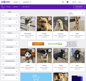
I’m trying to convince my fiance that we should get another dog (it’s not going as well as I hoped haha). I went to Petfinder just to browse. Once you enter your zip code and select what type of pet you’re looking for (dog, cat, rabbit, barnyard, etc), you can add so many fantastic filters. For example, I have a small dog already plus three cats so any animal I adopt needs to be good with other dogs and cats. We also plan to have children in the next five years or so which means the new pet should also be good with children. These are all important things to consider when adopting a pet and Petfinder makes it easy to narrow down your results.
Bad UX – Shop Disney
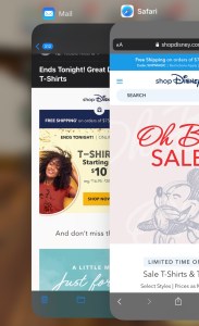
I collect Disney pins and get the Disney sale emails. I also have the ShopDisney app. It is very annoying that when I click a link in a ShopDisney email, it opens the mobile site rather than asking if I’d like to open the app. It makes me question whether I even need the app if they seem to want me to shop their mobile site.
Week 11
Good UX – Shop Disney

Shop Disney often does limited edition product lines that are very popular. When they launch, they often sell out very quickly. In order to ensure the site doesn’t crash and they can minimize any inventory issues, you’re brought to a virtual waiting room before you can shop the limited edition products. The copy instructs you not to refresh or click back, but the page will reload every so often. It doesn’t tell you it’s reloading, but the page flashes slightly in a way that you know it just refreshed itself. Once you’re admitted to the shopping page, the page automatically reloads. Because it reloads every so often, you feel you’re making progress and don’t mind waiting.
Bad UX – Shop Disney
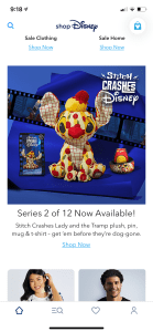
As I mentioned above, Shop Disney releases limited edition lines. This year they’re releasing a series called “Stitch Crashes Disney” and there’s a new set of merchandise each month. In the screenshot from the app above you can see the series 2 merch and underneath there’s a “Shop Now” link. When you tap the link, you’re brought to a screen that shows all the Stitch merchandise Shop Disney has available. I expect to see the series 2 merch if it’s still available.
The morning it was released I opened the app and tapped the “Shop Now” link–there wasn’t the series 2 pin. This made me think I missed the window and it was already sold out. Bummed, I texted a friend. She then tells me she’s in the virtual waiting room. I opened the mobile website, tapped the “Shop Now” link under the series 2 image and was also brought to the waiting room. Good news: I was able to get the pin.
This is an example of bad UX because they almost missed out on a sale because the app made it seem like the product is sold out. If they don’t want you using the app to shop limited edition merchandise or there isn’t the capability to open a browser (which I highly doubt), they shouldn’t push the limited edition merch on the app.
Week 12
Good UX – Petsmart.com

I get my dog groomed at Petsmart. She doesn’t always need an intense bath, sometimes I just want her nails trimmed. I love that once I sign in to Petsmart, it already knows I’m booking for Bailey (since she’s the only pet who gets groomed, she’s automatically selected) and I can quickly rebook with the groomers I know she does well with. It makes the rebooking process simple and very easy. Great user experience.
Bad UX – Michaels.com
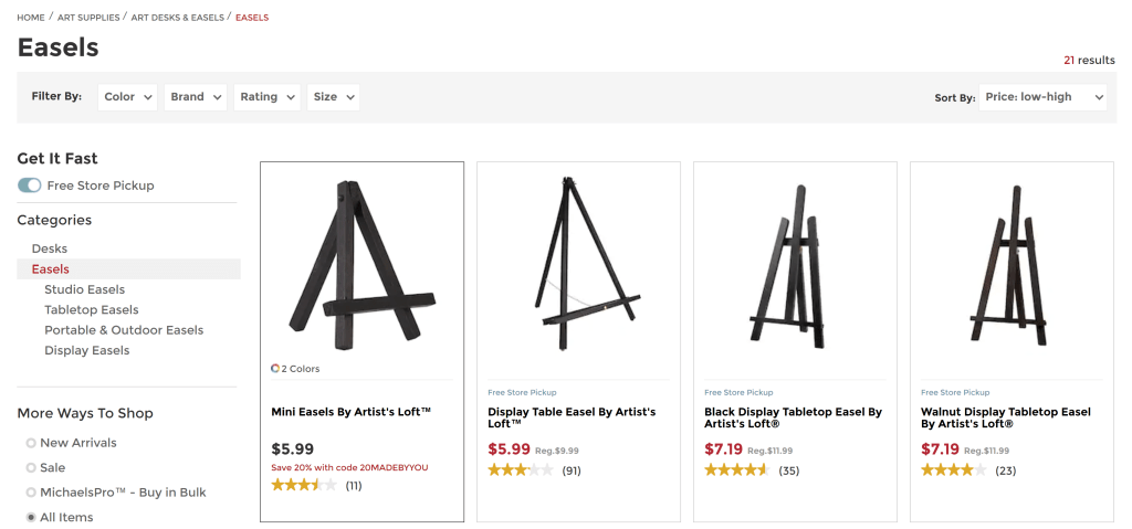
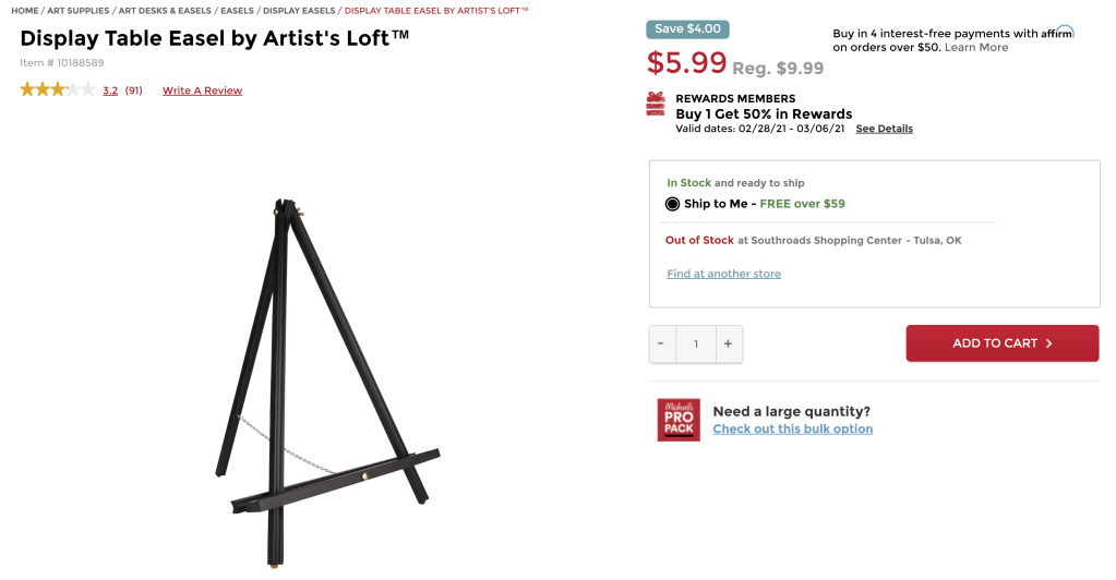
I’m attending a virtual painting class with my fiance this week. I bought the supplies from a local art store, but didn’t want to spend the money on two easels (which were $35 each). I received an email from Michaels today that mentioned easels were on sale. I clicked the link and reordered the easels in price from low to high then I tapped the “Available in Store” filter option assuming it would only show me easels that were available in the store I set as “my store”. That was not the case. The second screenshot shows you the easel I selected is not available in my store. This filter is basically useless.
